Contrary to popular belief, print brochures have not gone the way of the Velociraptor. Even in the face of rapidly evolving digital marketing, print brochures still have the ability to motivate patients and should be considered a valuable component in marketing one’s refractive and premium cataract services.
A recent survey conducted by Pew Research Center showed that Americans, young and old, prefer to read printed versus digital text.1 A study conducted by the Academic Reading Format International found that students reading digital text were less engaged, tended to skim text, and had more difficulty recalling what they read compared with students reading the same printed text.2
USEFUL FOR HIGH-VALUE PURCHASES
Print brochures are most effective when put in the hands of an engaged buyer. Most people do their initial research online and then contact several practices for a brochure to get a better feel for the practice. Fiona West, a marketing director who has extensively researched brochure usage, reported that a brochure is “a high-value takeaway for someone at the evaluation or trial stage of the purchase process and has particular benefit in reinforcing the emotional side of the decision.”3
However, all brochures do not have the same emotional impact. Recently, while filming a laser cataract surgery marketing video for a client, I asked one of the surgeon’s patients why she chose to have laser cataract surgery at that practice. She showed me brochures from two practices her optometrist recommended, both of which offered laser cataract surgery. One was a trifold produced by a device company, with the practice’s contact information stamped on the back; the other was a 16-page brochure printed on linen paper and filled with lifestyle photos, patient testimonials, patient-friendly procedural graphics, and a convincing story about why a patient should choose that practice. She said to me as she held them up, “Which of these two practices would you go to?”
THE RIGHT BROCHURE FOR THE OCCASION
Trifolds and quad-folds are the most common types of ophthalmic brochures available from the AAO and companies like Patient Education Concepts. These brochures are relatively inexpensive and better suited for mass distribution at health fairs, at surgical seminars, or in reception rooms. Initially, these types of stock brochures could only be overprinted with a practice’s contact information in black ink. However, with the proliferation and increased quality of digital presses, they can now be easily customized with color photos of the doctor, staff, logo, or building, and their interior content can be tweaked to suit any practice preferences.
Then once the patient has been evaluated and told he or she is a candidate for a refractive or premium cataract procedure, many practices present their patients with a higher-quality, larger-format print brochure. With more space and pages, these larger brochures can better explain the patient’s surgical options, and the doctor’s experience, expertise, and technology and also include patient testimonials, vivid imagery, and lifestyle scenes that are extremely effective in raising the perceived value of the services they provide.
As said by Stephen G. Slade, MD, “Printed brochures are solid gold, but they have to be large, high quality, and customized—ie, not a throwaway. That way, the patient takes it home and puts it on a coffee table or desk. The brochure may be there for weeks or months (or decades if you are like my wife Cyndi). ...The patient is likely to pick it up and read through it from time to time, and it is there for visitors to browse, getting so many more looks than a single digital brochure and read in a more relaxed setting. Referring doctors may have brochures from more than one surgeon, so yours needs to stand out.”
CREATING A WINNING BROCHURE
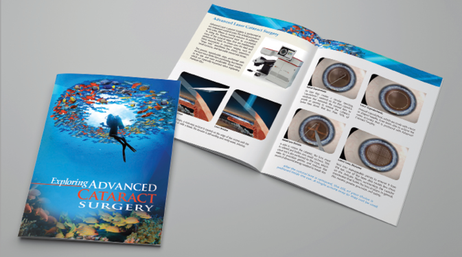
Size matters, but a brochure must also be dynamic, easy to understand, trustworthy, and motivating. It must have professional, high-quality images that grab the patient’s attention and communicate the benefits of your services. The layout should lead the patient seamlessly through the storyline with the appropriate use of anatomic graphics, headlines, and spatial design. The Figure in this article shows an example of these attributes, which are also listed in the checklist on this page. Some practices attempt to write, design, and print their brochures without professional help but find the experience to be extremely time-consuming and without access to the proper visuals, they often end up with something less than impressive. The bottom line is that professionally written and designed brochures are a key element to practice growth and will pay for themselves many times over.

Figure. Example of an effective ophthalmic brochure.
1. Book Reading 2016. Pew Research Center. http://www.pewinternet.org/2016/09/01/book-reading-2016/. Accessed March 19, 2018.
2. https://www.researchgate.net/publication/313031526_The_Academic_Reading_Format_International_Study_ARFIS_Investigating_Students_Around_the_World. Accessed March 19, 2018.
3. http://www.themarketingcentre.com/do-glossy-brochures-still-work-or-has-digital-marketing-killed-the-power-of-print/. Accessed March 19, 2018.


